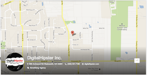
You may have noticed that cover photo on your Google+ page became much larger and at first glance it resembles a pencil push down ad commonly found on major media websites. This change to the Google+ layout took place on March 7th, but is still being rolled out to many pages. This has significantly impacted the real estate above the fold for your brand.
When you click on your profile pic, it reveals the new larger layout with a 2120p ×1192p cover photo which is taller than the old one. In some cases your background image is replaced all together with snapshot of your red pin on Google’s map as seen below. This occurs when your previous picture doesn’t fit the new layout. Additionally, the avatar or profile pic is now a circle vs. a square. If you’re an online agency like us, then you’re faced with lots of revisions. In our case the new circle avatar actually worked out alright, but we’ve still got to revise our cover photo again. Thanks Google!


