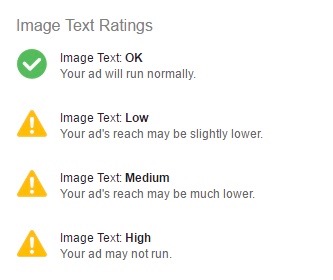
Although Facebook now officially says an ad won’t be automatically rejected for having more than 20% text in the image, Facebook’s algorithm applies an “image text rating” for ads or promoted posts. This new sort of sliding scale greatly determines your ad’s potential reach. This can be a huge impact especially for smaller niche audiences which are harder to reach. Previously,
Facebook required advertisers running ads on Facebook to meet the exact requirements laid out in their complicated 25-rectangle grid which divided an image into 25 sections. The requirement was that text could not cover more than five of the 25 rectangles which felt sorta like doing a captcha but selecting boxes with with text in them instead of buses or storefronts.
The reason for this subtle change to the 20% in-image text rule according to Facebook:
Our research has shown that people demonstrate a preference for ads with less text. Previously, if 20% of an ad image’s area was text, it was not approved to run on Facebook, Instagram or the Audience Network. We’ve heard from some advertisers that this can be confusing, as it’s not always clear that an ad does not meet the policy requirements until after creative has been submitted. We are shifting to a new solution to improve this experience which allows advertisers more flexibility while still allowing us to maintain an enjoyable experience for people
―Afsheen Ali, Product Marketing Manager, Facebook
In other words, people don’t really like reading so much and Facebook knows what’s best for you. Apparently we all really just want to look at pictures of puppies, old girlfriends and sandwiches. But seriously, there has been lots of recent research and A/B testing of ads with various amounts of text and the overwhelming verdict is less is more when it comes to ad engagement, sharing, and overall ad audience satisfaction.
Never stop testing, and your advertising will never stop improving.
― David Ogilvy, “Father of Advertising”
While research, testing and algorithms are great for learning what works best as a whole, the world of digital marketing is still “part art and part science” as Ogilvy would say. The subtle nuances of effective ads shouldn’t always be distilled down to rigid templates just because Facebook feels it’s what the masses want.
Life’s too short to put it into print.
― Anthony T.Hincks
Regardless, paying attention to the 20% in-image text rule is still important. However, most experienced digital marketing agencies like DigitalHipster don’t like the final approval of their Facebook ads being decided on by Facebook’s algorithm or their internal review team. What’s next? No text in images? What if Facebook’s team decides people only like certain fonts, and the algorithm determines 80% of your fonts should be Comic Sans? God forbid!
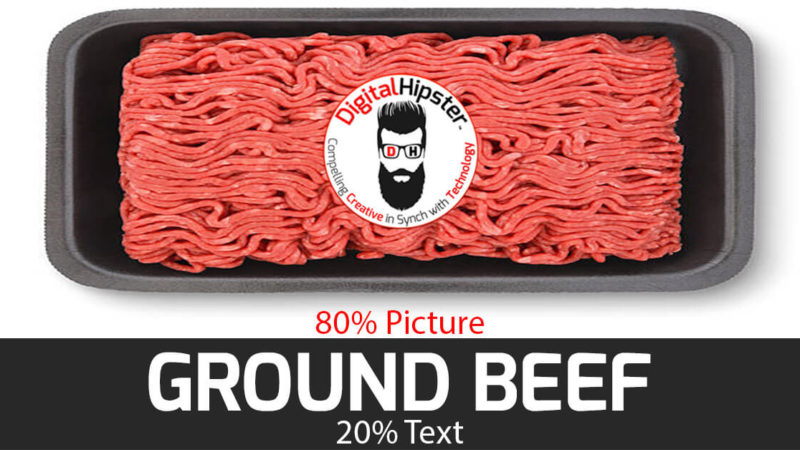
Facebook used to provide their text overlay tool to check if your ad or promoted post complies. The tool didn’t work on mobile and has since been discontinued. We ran this blog post’s image through it, and just like ground beef it passed the “80/20 test.”
Is your business is having trouble keeping up with all the constantly evolving Social Media and digital marketing rules and best practices? Give us a call at 330-331-7189 or contact us today for a free initial consultation to see whether or not we can help you.

